What This Book Cover Gets Right About Emotional Truth
CM
Book Cover Design. Become The Parent You Needed
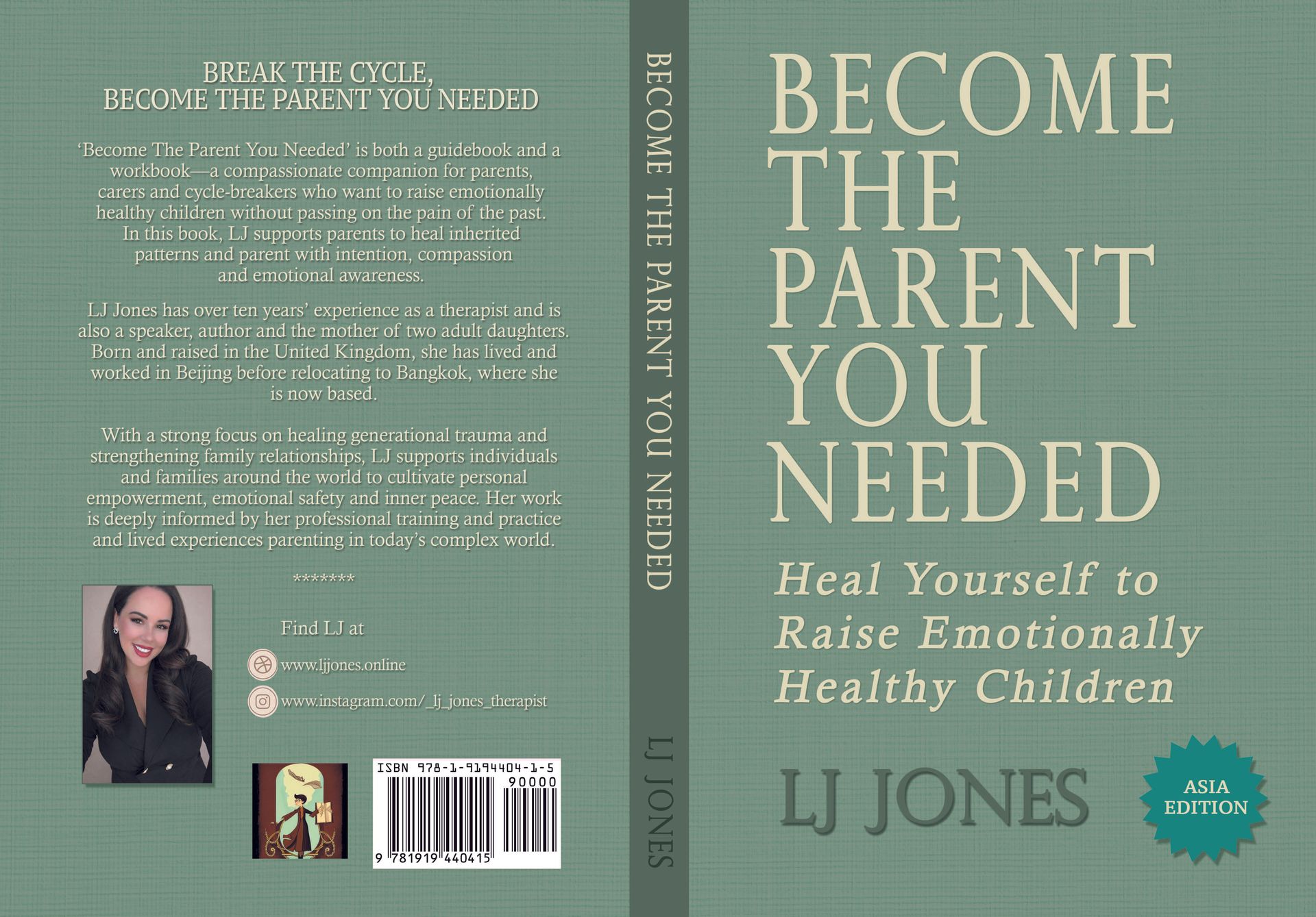
In publishing, good cover design isn’t about decoration. It’s about translation. A cover must translate a complex emotional promise into a single, silent moment of recognition. If the reader feels understood before they’ve read a word, the design has done its job. I believe this cover largely succeeds because it understands that principle and resists the urge to shout. There is simply too much noise in the modern world.
Colour as Emotional Contract
Ah, what to do about the colours...The muted sage-green palette immediately communicates calm, safety, and emotional steadiness and this is not accidental. In parenting and trauma-informed publishing, colour is not aesthetic garnish; it is a psychological contract with the reader. Just like the author when she is working with her clients using contracts and clear messaging.
Green signals regulation, balance, and restoration. Combined with the subtle textile-like texture, the design feels human, tactile, and grounded, never slick or performative. Importantly, it avoids the sterile blues of clinical psychology and the hyper-warm pastels often used to soften difficult subject matter. I think this choice respects the reader’s intelligence and emotional depth.
Typography That Knows When to Lead and When to Step Back
The serif typography does heavy lifting here, signalling authority, maturity, and longevity. This is a book that wants to live on shelves for years, not trend for a season. The title’s scale is confident without being aggressive, and the spacing allows it to breathe; something many self-help covers forget in their race to be noticed.
The italicised subtitle introduces a gentler voice, reinforcing the book’s emotional intention. The typographic hierarchy is clear and disciplined with no visual ego, no confusion about what matters most.
Layout That Signals Emotional Intelligence
The front cover’s restraint is one of its strongest assets. There is no clutter, no visual anxiety. In a genre dealing with generational trauma and emotional repair, this matters more than most designers realise. Calm design is not passive; it is intentional.
The spine deserves particular praise. Clean, legible, and well-balanced, it performs exactly as it should in physical retail. I still think this is one of the most overlooked realities in modern book design.
On the back cover, the copy is well spaced and readable, and the author photograph strikes the right balance between professional and approachable. In therapist-led titles, trust is everything. This image builds it quietly.
Genre Signalling Without Stereotype
This cover knows exactly who it is for and, just as importantly, who it is not for. It clearly positions itself within parenting, emotional healing, and trauma-informed work without drifting into influencer culture or pop-psychology shortcuts. It does not promise quick fixes. It does not aestheticise pain. It invites reflection rather than consumption.
That is a commercial risk and a long-term strength. But we'll go with it.
The edition badge is functional and clear.
The Bigger Picture: Design That Respects the Reader
The design already does the hardest thing well: it respects the emotional intelligence of its audience. Good book covers don’t shout for attention.
Great ones create trust.
This cover is already speaking in a calm, steady voice. As does the author, LJ Jones. Good job and kudos to our design team on this one; LJ, Niall and Dorothy.
-Conor MacGiolla Bhuí, MSc. January 2026 ©
*LJ's book will be available for purchase from February 1st 2026.