Book Cover Design. 'Quackers In Love'
TS
Our Niall was asked to design Dr Em Mardlin's latest book cover, 'Quackers In Love', and our followers often ask about design concepts, so here's some thoughts on his thinking and process...
Designing this cover was never about spectacle. It was about restraint. In publishing, restraint is often the hardest discipline because it demands confidence; confidence in the message, the reader and the silence between elements. This cover was built deliberately to feel like it belongs in that silence.
The palette begins with a warm parchment background rather than stark white. White can feel clinical. Cream feels human. That distinction matters for a book about relationships. The tone sits somewhere between paper, skin, and candlelight subconsciously signalling warmth, reflection, and sincerity. The red heart is the only strong colour on the cover. That choice is intentional. By limiting saturation to one element, the symbol becomes the emotional anchor. It doesn’t shout.
The title uses a serif face with classical proportions. Serif fonts carry intellectual and historical weight; they whisper credibility rather than demanding it. For a book grounded in values and reflection, that visual voice matters.
The subtitle, by contrast, uses a clean sans-serif. This pairing creates tension and tension creates interest. Serif says wisdom. Sans-serif says clarity. Together they say trusted guidance.
Spacing was treated as carefully as the letters themselves. Wide tracking in the subtitle slows the reader’s eye, forcing attention. It makes the words feel deliberate, almost meditative.
Nothing overlaps. Nothing crowds. This creates psychological ease. Readers don’t consciously analyse spacing, but they do feel it. Balanced alignment tells the brain: this book is organised, thoughtful, reliable. Whitespace isn’t emptiness. It’s authority.
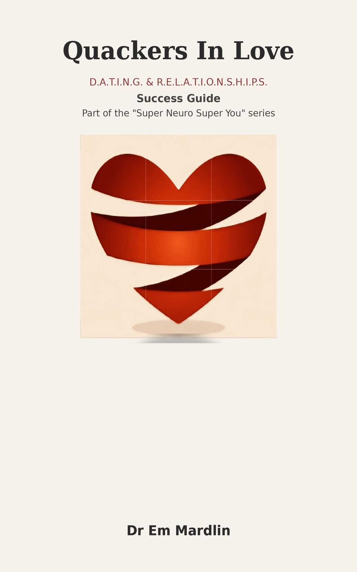
The heart is not an ornament. It is the thesis statement.
Placed slightly above centre, it becomes the visual hinge of the composition. The soft shadow beneath it grounds the image, giving it presence without theatricality. The effect is subtle but important: the symbol feels placed, not pasted.
This cover avoids the most common trap in relationship titles emotional exaggeration. There are no gradients, sparkles, or cinematic flourishes. Instead, the mood is calm, reflective, steady. That calmness communicates something powerful before a reader ever opens the book: this is guidance, not hype.
Good covers are not posters. They are emotional thresholds. When someone looks at this design, the aim is not that they think that’s pretty. The aim is that they feel something quieter: This might actually help me. That moment of recognition is what design is for.
The strongest covers rarely look complicated. They look inevitable as if they could never have been anything else. That is always the goal: remove everything unnecessary until only meaning remains. #BookCoverDesign